The world of corporate marketing communication is all about grabbing eyeballs and the clients for the Digit are one of the largest outdoor media companies in the country. As corporate brand identities become ubiquitous to the urbanscape, corporate marketing communication relies heavily on high visual impact in a fleetingly brief engagement. The Digit feeds exactly off that very principle.
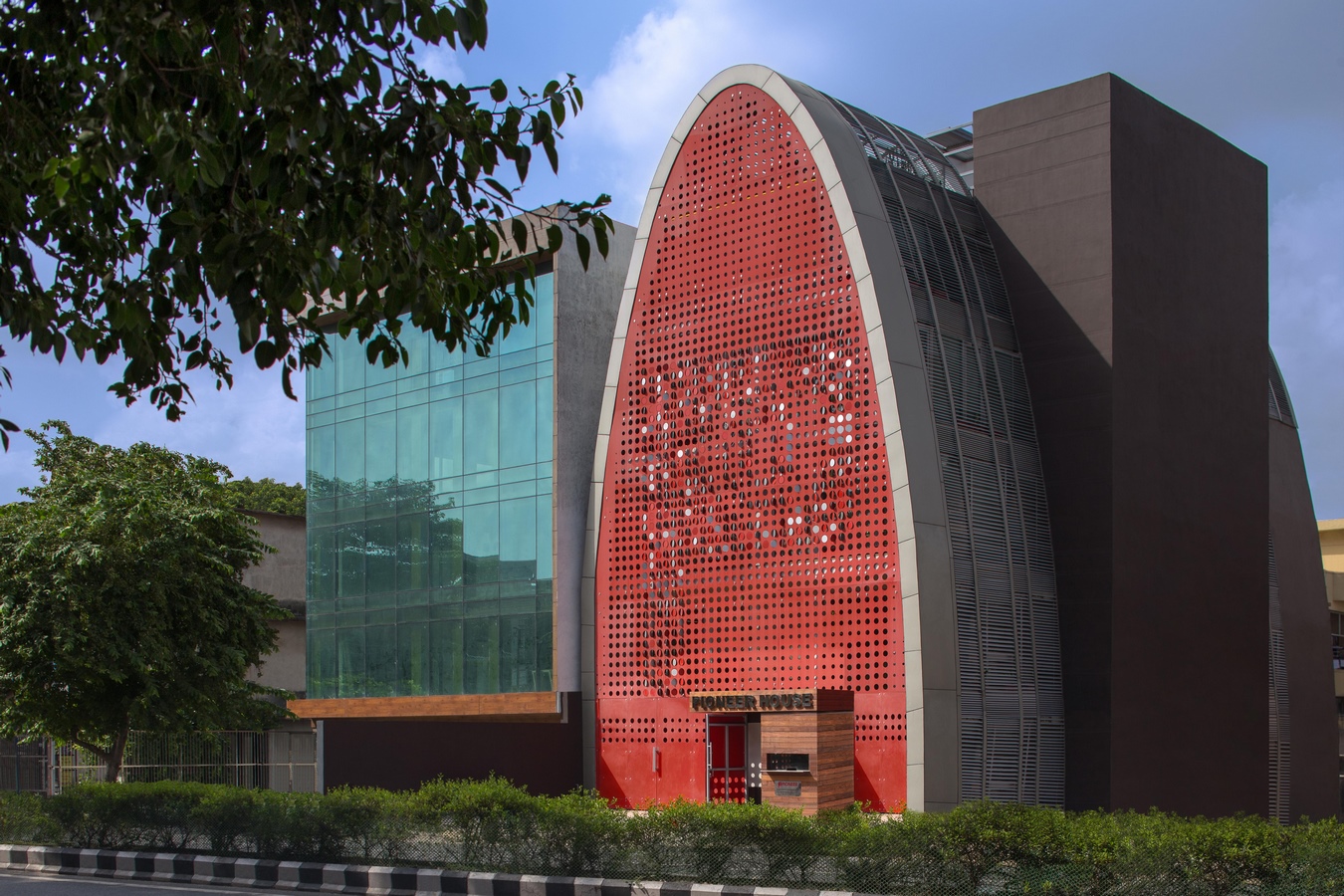
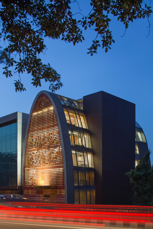
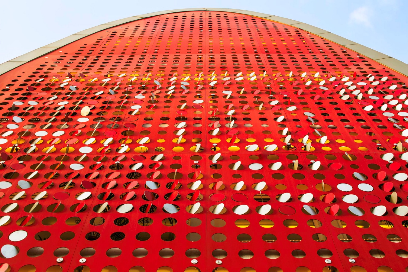
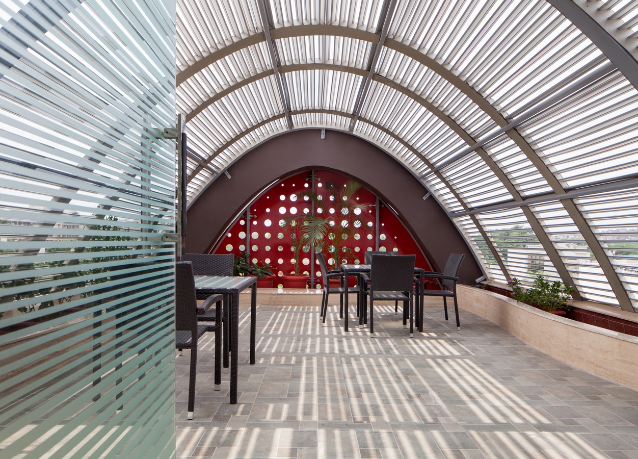
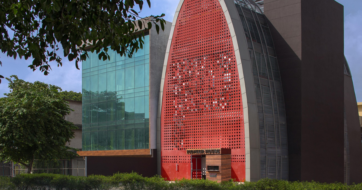
Surrounded by an unbroken line of buildings with full rectangular facades and dingy interiors, the Digit stands as an edifice with its striking red facade and form. The fluttering, shimmering red screen, perforated with the company’s logo symbolises its “digital identity” while mitigating the noise and heat gain from the road in front. Its semi-elliptical cylindrical form not only allows sufficient natural light into the workspaces through its louvred skin, it also reinforces the hierarchy of the organisation with the work force and management segregated into various floors of ascending seniority and reducing occupancy.
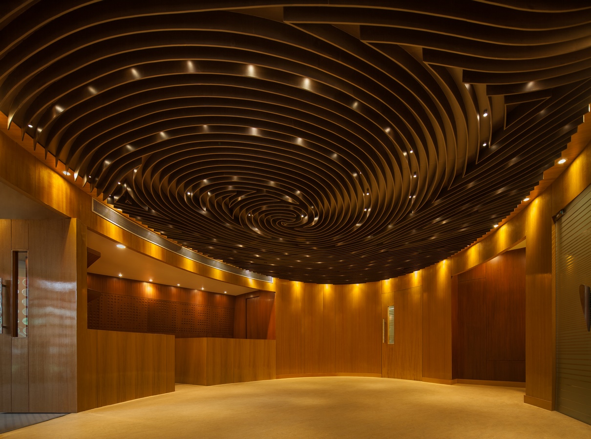
The design was an exploration of the notion of identity (corporate, organisational and individual) and its urban projection. The thumbprint, semiotically the most common idiom of identity, inspired the form as well as the interiors.
The architecture projects an arresting visual language and the split second impact of a roadside billboard while simultaneously committing to a deeper value and meaning to the organisation, the edifice and the occupant.
Gold Winner – Archframe Design Awards 2023
Design Firm – Anagram Architects
Project Title – The Digit
Project Category – Commercial Building
Status – Built
Architect – Vaibhav Dimri
Design Team – Vaibhav Dimri, Madhav Raman, Aditi Singh, Richa Gupta
Profile – Professional Architect
Country – India
